 Anta design system
Table
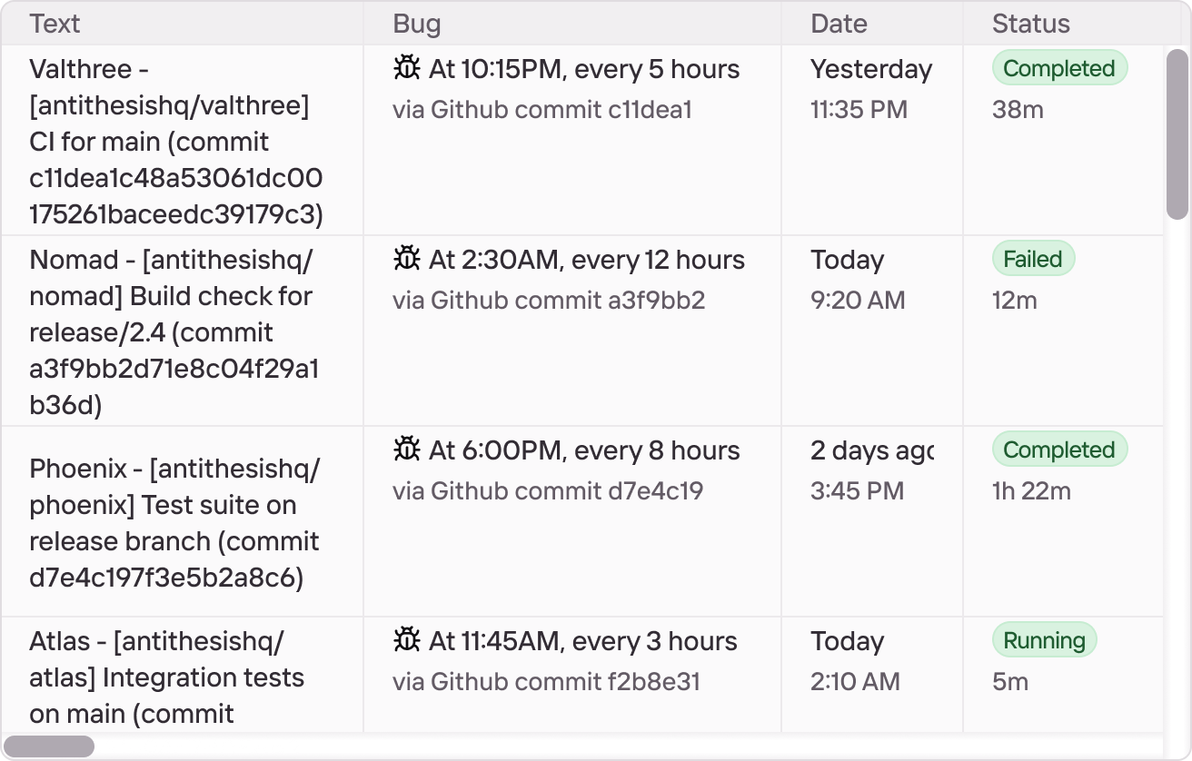
A tabular layout for structured data — rows, columns, headers, sorting,
selection. Not yet shipped in @antadesign/anta. For now, use the
component published in the Anta Figma library; the React/web-component
implementation will follow.
Status
Available in Figma; not yet implemented in code. There is no
<Table> component or <a-table> element to import. This page will
grow Props / Examples / Tokens sections once the component lands.
Figma source
The Table component lives in the Anta 0.2 Figma library:
Preview
Plain HTML tables
While the <Table> component is in design, Anta’s reset.css ships a
polite baseline for the native <table> element so plain HTML tables
look intentional out of the box. The defaults are deliberately minimal:
top-left aligned cells with 5 × 10 px padding, hairline row separators
in --border-5, semibold <thead> cells, and no outer frame or
column dividers. Set font-variant-numeric: tabular-nums so numeric
columns line up.
All rules live inside @layer anta, so any consumer rule outside a
layer (or in components / utilities) overrides without specificity
fights or !important.
Default
| Token | Value | Usage |
|---|---|---|
| —text-1 | #1c1f23 | Primary body copy |
| —text-3 | #52575e | Secondary labels, sidebar links |
| —border-5 | #e8eaed | Hairline dividers, table row separators |
<table> <thead> <tr><th>Token</th><th>Value</th><th>Usage</th></tr> </thead> <tbody> <tr><td>--text-1</td><td>#1c1f23</td><td>Primary body copy</td></tr> … </tbody></table>Bordered
Add data-bordered to draw the outer frame, vertical column dividers,
and 3 px rounded corners. Under the hood the variant switches to
border-collapse: separate because border-radius doesn’t render
reliably with collapsed borders.
| Token | Value | Usage |
|---|---|---|
| —text-1 | #1c1f23 | Primary body copy |
| —text-3 | #52575e | Secondary labels, sidebar links |
| —border-5 | #e8eaed | Hairline dividers, table row separators |
<table data-bordered> …</table>With a caption
<caption> is the semantic title for a data table — the first child of
<table>, announced by screen readers as the table’s accessible name.
Browsers render it as a block above the rows; Anta’s only opinion is
left alignment (browser default is centered).
| Token | Role |
|---|---|
| —text-1-brand | Logo wordmark |
| —text-3 | Nav link, idle state |
| —text-1 | Nav link, current page |
<table data-bordered> <caption>Color tokens used by the docs sidebar</caption> <thead> <tr><th>Token</th><th>Role</th></tr> </thead> <tbody> <tr><td>--text-1-brand</td><td>Logo wordmark</td></tr> … </tbody></table>